Building a Website for a 40-Year-Old Hair Salon With Zero Online Presence
A local salon in Smithfield, Utah had been cutting hair for four decades without a website. Here's how I built one from scratch with vanilla HTML, CSS, and JS.
A local hair salon in Smithfield, Utah reached out and needed a website. Total E’Clips has been cutting hair for over 40 years, serving families across Cache Valley. Three stylists, a loyal client base, and not a single page on the internet. No Google Business profile to speak of, no social media presence beyond a Facebook page, nothing. They wanted something simple that told people who they are, what they offer, and how to book.
The catch: there was almost nothing to work with. No existing branding, no professional photos, no written copy. Just a business name, a phone number, and 40 years of word-of-mouth reputation.
What the site needed to do
This isn’t a SaaS product or a portfolio piece. It’s a small-town salon. The site needed to:
- Show what services they offer (cuts, color, nails, waxing)
- Make it dead simple to call and book
- Look professional enough to build trust with new customers searching online
- Work perfectly on phones, because that’s how most people will find it
I went with plain HTML, CSS, and vanilla JavaScript. No frameworks, no build tools, no npm install. For a single-page site like this, shipping three files is the right call. It loads instantly, there’s nothing to break, and anyone can open the code and understand it.
The design system
I wanted the site to feel warm and premium without looking like a generic template. The color palette centers on a warm tan/gold accent against charcoal backgrounds. All defined as CSS custom properties so the entire theme can be updated by changing a few values:
:root {
  --color-dark: #2C2C2C;
  --color-light: #FAF8F5;
  --color-accent: #C4A882;
  --color-accent-hover: #A8896A;
  --color-body: #4A4A4A;
  --color-text-light: #F5F0EB;
  --font-heading: 'Bebas Neue', sans-serif;
  --font-body: 'Raleway', sans-serif;
}
Bebas Neue for headings gives it that bold, modern salon feel. Raleway at weight 300 for body text keeps everything light and readable. Two fonts, one accent color, and the whole site feels cohesive.
Scroll animations without a library
I wanted elements to fade in as you scroll down the page. Most people reach for a library for this. You don’t need one. The IntersectionObserver API does exactly this in about 12 lines of JavaScript:
const observer = new IntersectionObserver((entries) => {
  entries.forEach(entry => {
    if (entry.isIntersecting) {
      entry.target.classList.add('is-visible');
      observer.unobserve(entry.target);
    }
  });
}, { threshold: 0.1 });

document.querySelectorAll('.animate-on-scroll').forEach(el => {
  observer.observe(el);
});
The CSS side is just as simple. Elements start translated down and invisible, then transition into place:
.animate-on-scroll {
  opacity: 0;
  transform: translateY(30px);
  transition: opacity 0.6s ease, transform 0.6s ease;
}

.animate-on-scroll.is-visible {
  opacity: 1;
  transform: translateY(0);
}
The key detail: observer.unobserve(entry.target) after the animation fires. Each element animates once and then the observer stops watching it. No wasted cycles on elements that already appeared.
Staggered card animations
The service cards cascade in one by one instead of all appearing at once. This is pure CSS, no JavaScript timing needed. Each card gets a slightly longer transition delay:
.service-card:nth-child(2) { transition-delay: 0.1s; }
.service-card:nth-child(3) { transition-delay: 0.2s; }
.service-card:nth-child(4) { transition-delay: 0.3s; }
.service-card:nth-child(5) { transition-delay: 0.4s; }
.service-card:nth-child(6) { transition-delay: 0.5s; }
When the IntersectionObserver triggers is-visible on each card, the delays mean they appear in sequence. It’s a small touch that makes the page feel alive instead of static.
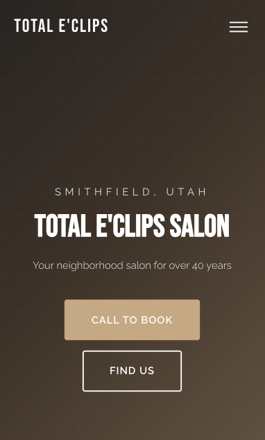
The hero section
The hero uses a CSS gradient background with an SVG pattern overlay for texture. No images needed, so it loads instantly and scales to any screen:
.hero {
  position: relative;
  height: 100vh;
  min-height: 600px;
  display: flex;
  align-items: center;
  justify-content: center;
  background: linear-gradient(135deg, #2C2C2C 0%, #5C4A3A 40%, #C4A882 100%);
  overflow: hidden;
}
A subtle cross pattern is layered on top at 3% opacity using an inline SVG data URI in the ::before pseudo-element. You barely notice it, but it adds depth that a flat gradient alone doesn’t have.
The hard part wasn’t code
The code came together fast. The actual challenge was content. When a business has had zero internet presence for 40 years, there’s nothing to reference. No existing copy to refine, no “About Us” page to rewrite, no photos to pull from.
I had to piece together the story from conversations. Who are the stylists? How long have they been there? What’s the vibe of the place? The copy needed to sound like a real neighborhood salon, not a marketing template. Lines like “Your neighborhood salon for over 40 years” worked because they’re true and specific. Generic phrases like “providing excellent service” would have said nothing.
Getting the testimonials right took multiple rounds too. Real words from real clients, not AI-generated filler.
What I’d do differently
Use a static site generator. Vanilla HTML was fine for this scope, but if the salon ever wants a second page or a blog, editing raw HTML gets tedious fast. Astro would have been a natural fit. Still static output, still fast, but with components and templating that make updates easier.
Get all the details upfront. I went back and forth more than I should have on service descriptions, the “About” section copy, and contact details. Next time I’d send a structured questionnaire before writing a single line of code. Business hours, services with descriptions, team bios, payment methods, accessibility info. Collect it all in one pass.
Push harder on photography. The images/ folder is empty. The site works without photos, the gradient hero and SVG icons carry the visual weight. But a few real photos of the salon interior and the stylists at work would add a level of authenticity that design alone can’t replicate.
Where it stands
The site is live and does what it needs to do. It gives Total E’Clips a real online presence for the first time in their 40-year history. Customers can find them, see what they offer, and call to book, all from their phone. The entire thing is three files: one HTML, one CSS, one JS. No dependencies, no build step, nothing to maintain.
Sometimes the right tool for the job is the simplest one.
Share this post
Stay in the loop
Get notified when I publish new posts. No spam, unsubscribe anytime.
Built as part of
View the project →